CASE STUDY
ART GALLERY TOUR APP
ConnectTour
01Product Features
We understand the challenges art aficionados face when trying to locate and book art tours. This is why our goal is to design an application that will revolutionize your art touring experience. With Sass Art Tours, we aim to provide a streamlined solution that makes discovering, booking, and enjoying art tours a seamless and effortless process. Continue reading as we unpack the journey towards simplicity and convenience in the world of art tours.
Minimal Design
Responsive Design
Interactive Gallery

Case Study Overivew
My Role: UX Designer, Researcher and Developer
UI/UX designer from conception to delivery through agile development and design thinking.
My Responsibilities:
User Research: Delving into the needs and behaviors of art enthusiasts to inform design decisions.
Wireframing: Crafting both paper and digital wireframes to lay the foundation for intuitive user flows.
Prototyping: Developing low and high-fidelity prototypes to visualize the end-to-end user experience.
Development: Bringing the design to life with functional and responsive code.
Usability Studies: Conducting thorough testing to refine and enhance the user interface.
Accessibility: Ensuring the app is accessible to all users, including those with disabilities.
Design Iteration: Continuously iterating on the design based on user feedback and usability findings.
Project Duration:
July 2023- August 2023
The Problem:
Art aficionados are in search of a streamlined solution that not only helps them locate art tours but also offers an effortless booking and touring experience for all users.
The Goal:
To design an application that embodies simplicity and convenience, allowing customers to seamlessly book and partake in art tours offered by Sass Art Tours.

ConnecTour App
The aim is to revolutionize the way art lovers discover and engage with art tours. By developing an app that simplifies the process of finding, booking, and experiencing art events right from your phone.
02Empathize Phase
In the Empathize Phase, the focus is on understanding the users’ needs, experiences, and motivations. This involves engaging with users through interviews, surveys, and observation. The goal is to gather rich, qualitative data that offers deep insights into the users’ world, enabling a human-centered approach to design.
Study Details
Research Methodology
As the UX Designer, I actively engaged with families and art aficionados to shape a platform that reflects their needs. My hands-on approach in building empathy maps and conducting competitive audits informed a design strategy that delivers a streamlined and intuitive user experience.
The focus user group identified were families and art enthusiasts who attend art shows at least 3-5 times a year.
Prior to launch, it was crucial to assess the simplicity of the ticket purchasing process for our users. I aimed to pinpoint the specific hurdles they might encounter, from the initial online purchase to their event attendance, and to devise solutions to streamline their experience.
In completion evidence was gathered to determine if users can complete desired tasks. Based on the results, I determined a refined user flow and optimization.

Research Questions
- How long does it take for a user to select and find an event in the app?
- What can we learn from the steps that users take during the checkout process?
- Are there any parts where users are getting stuck?
- Can users benefit from QR technology?
Participants
5 participants
- Participants are families and art enthusiasts who attend art shows 3-5 times a year.
- Two males, two females, and one individual with vision impairment, between the ages of 25-75
Methodology
Users were asked to perform tasks in a low-fidelity prototype.
- Unmoderated usability study
- 10 minutes per participant
Geolocation
- United States, Remote Location
Usability Q&A
Interview Questions
Interest
How often do you attend art events or tours?
Participant 1: “About 4 times a year.” Participant 2: “Almost every other month.” Participant 3: “Whenever there’s something interesting, so maybe 3 times a year.” Participant 4: “5 times a year, especially during holidays.” Participant 5: “Rarely, maybe once a year due to my vision impairment.”
Awareness
How do you usually find out about art events?
Participant 1: “Social media.” Participant 2: “Word of mouth.” Participant 3: “Art blogs.” Participant 4: “Family-friendly event websites.” Participant 5: “Accessibility-focused platforms.”
Challanges
-
What challenges do you face when trying to find and attend art events?
Participant 1: “Information is scattered; hard to find everything in one place.” Participant 2: “Accessibility is a concern for me.” Participant 3: “Sometimes the events are sold out by the time I hear about them.” Participant 4: “I find it hard to know if an event is family-friendly.” Participant 5: “The websites are usually not very accessible for me.”
Demand
What features would you like to see in an art event app?
Participant 1: “A calendar integration.” Participant 2: “Voice-over descriptions for the art.” Participant 3: “Family-friendly tags.” Participant 4: “Virtual previews.” Participant 5: “High contrast and large fonts for better visibility.”
Expectations
How important is the ease of the checkout process for you?
Participant 1: “Very, I don’t have time to waste.” Participant 2: “Moderately, as long as it’s secure.” Participant 3: “It’s crucial; I’ve abandoned carts due to complicated checkouts.” Participant 4: “Important, especially if I’m booking for the whole family.” Participant 5: “Very important, and it needs to be accessible.”


Empathy Map
User Reasearch: Pain Points
- Complex Navigation: Users may find it difficult to navigate through the app to find the art events they’re interested in, leading to frustration and potential abandonment.
- Limited Search Filters: The absence of robust search filters could make it challenging for users to find events that match their specific interests, time availability, or location.
- Unclear Pricing: If the app doesn’t provide transparent pricing for each tour, including any additional fees, users may be hesitant to proceed with a purchase.
- Accessibility Issues: For users with vision impairment or other disabilities, the app may lack the necessary accessibility features, making it difficult for them to engage with the content and complete a purchase.
User Story
As a user, I want to be able to easily find and select an art event online, so that I can quickly and conveniently book a tour that matches my interests and availability.
User Story
As a user, I want the checkout process to be simple and straightforward, so that I can easily and securely complete my ticket purchase without encountering any confusion or unnecessary steps.
The customer journey for purchasing tour or event tickets for an art gallery involves the following steps:
- Open the app
- Navigate to the home screen
- Search for tours
- Select the desired event
- Decide whether to purchase the ticket or not
- Confirm the purchase
- Scan the ticket
- Check-in at the event
- Attend the event
- View the thank you screen
Goal Statement: Our tour app will let users register and check-in online for upcoming events which will affect art lovers by providing a simple and convenient way for customers to book and attend tours. We will measure effectiveness by tracking user engagement, customer satisfaction, and the number of successful bookings made through the app.

Throughout this journey, the goal is to provide a simple and convenient experience for customers to book and attend tours. By understanding the pain points and needs of users through user research, the app can be designed to address specific challenges and enhance the overall user experience.
Usability Study
Findings and Insights
Multiple usability studies were conducted to gather insights and feedback from users. The findings from these studies provided valuable information for improving the design and usability of the ConnecTour app.
Round 1 Findings:
During the first usability study, several key insights were gathered:
- Users expressed the need for a more intuitive way to add items to their cart. The current process was found to be confusing and required too many steps.
- Users also mentioned the need for more straightforward options on the welcome screen. Some participants found it difficult to navigate from the home screen to the booking screen.
Round 2 Findings:
In the second round of usability testing, additional insights were obtained:
- Users expressed the desire to be alerted about upcoming events. They wanted a feature that would notify them about new events and allow them to save events and artists as favorites.
- Participants also mentioned the need for an easier way to edit their cart. They wanted the ability to deselect items from their cart without going through the entire checkout process again.
Recommendations
Based on Usability Study Findings
By implementing these recommendations, the ConnecTour app will be designed to address the pain points identified in the usability study and provide a more user-friendly and streamlined experience for booking art tours.
Streamline the Adding to Cart Process:
Simplify the process of adding items to the cart to reduce confusion and the number of steps involved. Consider providing clearer instructions and visual cues to guide users through the process. This will make it easier for users to select and add items to their cart.
Enhance the Check-out Process:
Based on the findings from the usability study, it is evident that the “Add to Cart” feature could be optimized to provide a more seamless and efficient experience. Consider reducing the number of steps involved in the check-out process and making it more intuitive for users to complete their purchases.
03Define Phase
The Define Phase is where insights from the empathize phase are synthesized into a clear problem statement. This phase involves identifying core user needs and defining the scope of the challenge. It’s about distilling the information gathered into a focused direction for the design, ensuring that the project stays user-centered.
Theme #1 Getting Started
Participants found value in the booking app
- 5 out of 5 participants found this app useful when booking a tour.
- Some users found it difficult to get to booking screen from home page
“I never been on an art tour before, but I can see how this would help”
-Tyreke (Atlanta, Ga)
Theme #2 Navigation Issues
Some participants found adding to cart confusing
- 3 out of 5 participants had trouble adding tour to cart
- Some users felt there were too many steps.
“I guess that makes sense to click what you want, but the add to cart button was on all the options so I thought the right thing to do was to just select the image”
-Nina (Atlanta, Ga)
Theme #3 Check in Process
QR Feature for check-in
- 5 out of 5 participants thought this feature is simple and convenient.
I think this is a nice concept. I would use it to check out events. Its kinda like Eventbrite.
-Mike (Atlanta, Ga)
04Ideate Phase
During the Ideate Phase, the goal is to generate a wide range of creative solutions to the defined problem. This phase involves brainstorming sessions, sketching, and exploring different perspectives. It’s a divergent phase where quantity is encouraged to open up the possibility of innovative solutions.
Qualitative Insights:
- Navigation Issues: Participants expressed confusion about how to add a tour to their cart. This suggests that the UI/UX design may need to be more intuitive.
- Getting Started: Some participants were unclear about their options when first using the app, indicating a need for a more straightforward onboarding process.
- Usefulness: All participants found value in the app, highlighting its potential to meet user needs effectively.
- Check-in Process: The majority of participants appreciated the QR feature for check-in, describing it as “cool” and convenient.
- Other Features: The prefill payment screen was well-received by some users, suggesting that convenience features like this are appreciated.
Quantitative Insights:
- Navigation Issues: 60% of participants had trouble adding a tour to their cart.
- Getting Started: 40% of participants had difficulty understanding how to get started with the app.
- Usefulness: 100% of participants found the app useful.
- Check-in Process: 80% of participants liked the QR feature for check-in.
- Other Features: 40% of participants liked the prefill payment screen feature.

Synthesized Recommendations
- Welcome Screen: Provide clear and straightforward options on the welcome screen to help users easily navigate to their desired actions. This will ensure a seamless onboarding experience and reduce any confusion or friction.
- Adding Items to Cart: Simplify and make the process of adding items to the cart more intuitive for users. Reduce the number of steps involved and provide clear instructions or cues to guide users in selecting and adding items to their cart.
By implementing these recommendations, the ConnecTour app can enhance its usability and provide a more user-friendly experience for booking art tours.
05Design Phase
The Design Phase is where concepts start taking shape. This involves creating wireframes, prototypes, and high-fidelity designs. It’s a phase of iterative design, where feedback is continually sought from users and stakeholders to refine and improve the design. This phase ensures that the solution is both aesthetically pleasing and functionally effective.
Paper wireframes
Taking the time to draft interactions of each screen helped to design a well-suited path to address users pain points. Each element of the app prioritizes a quick and easy selection process to guide the user through a seamless path.

Digital wireframes
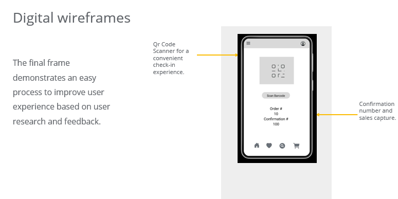
For the initial design I was going for simple, modern and contained for easy access to address users pain points. The final frame demonstrates an easy process to improve user experience based on user research and feedback.
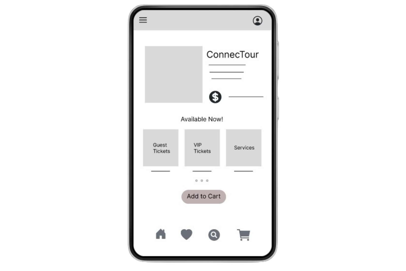
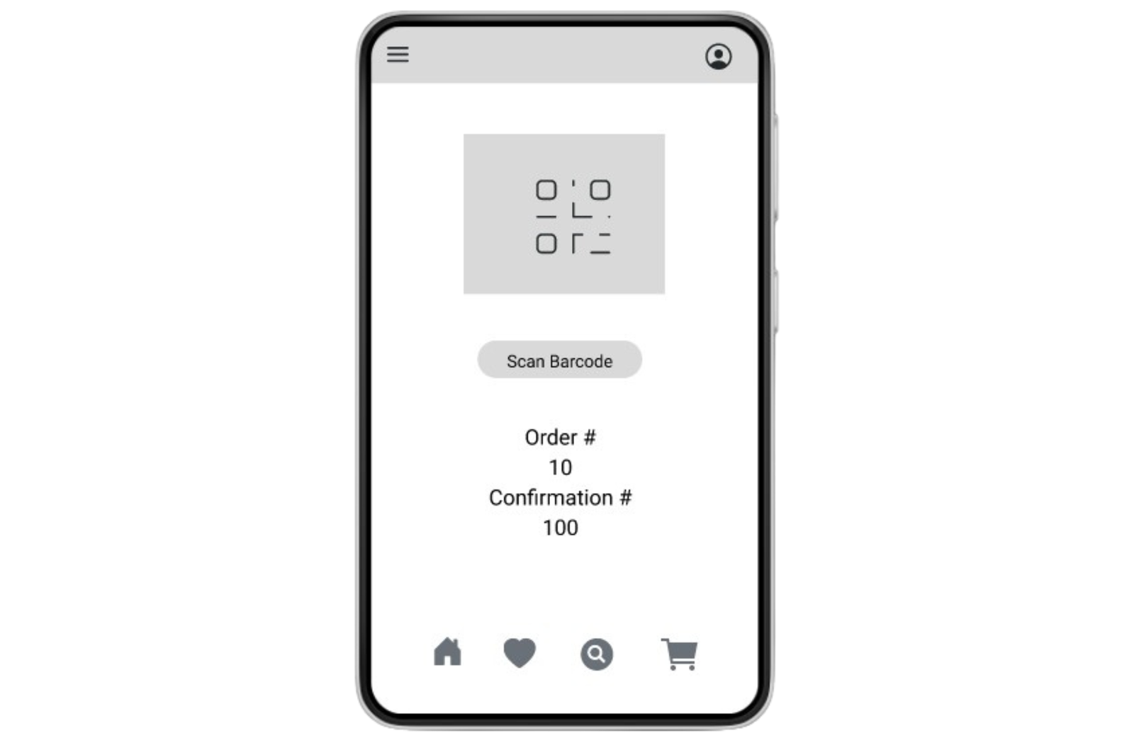
Low-fidelity prototype
This low fidelity prototype maps user flow for locating and purchasing tour packages. Incorporating usability and accessibility features to solve user pain points and identified in user research.
ConnecTour App

06Development Phase
In the Development Phase, the design is transformed into a working product. This involves coding, testing, and debugging. It’s a collaborative effort between designers and developers to ensure that the final product aligns with the design vision and meets the users’ needs. This phase also includes user testing to iron out any issues before the final launch.

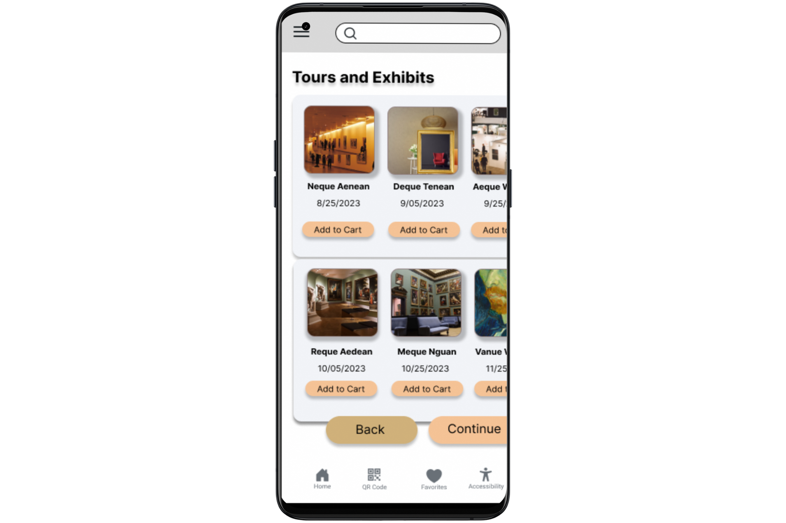
Mockups
This mockup shows an alternate version including full width button designs and complimentary images were added to check out screens.

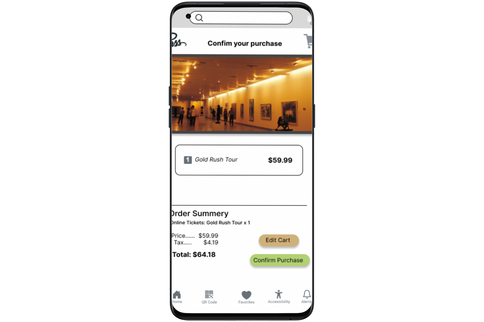
High-Fidelity Mockup
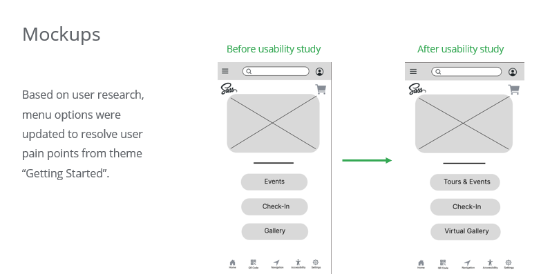
Based on user research, design of menu options were updated to resolve similarities in component look and feel.
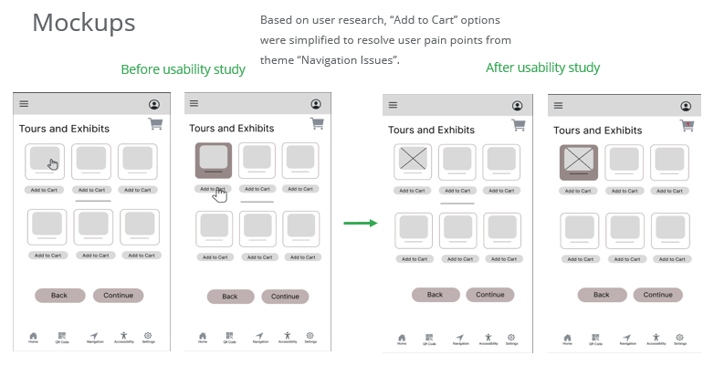
Based on user research, “Add to Cart” options were simplified to resolve user pain points from theme “Navigation Issues”.
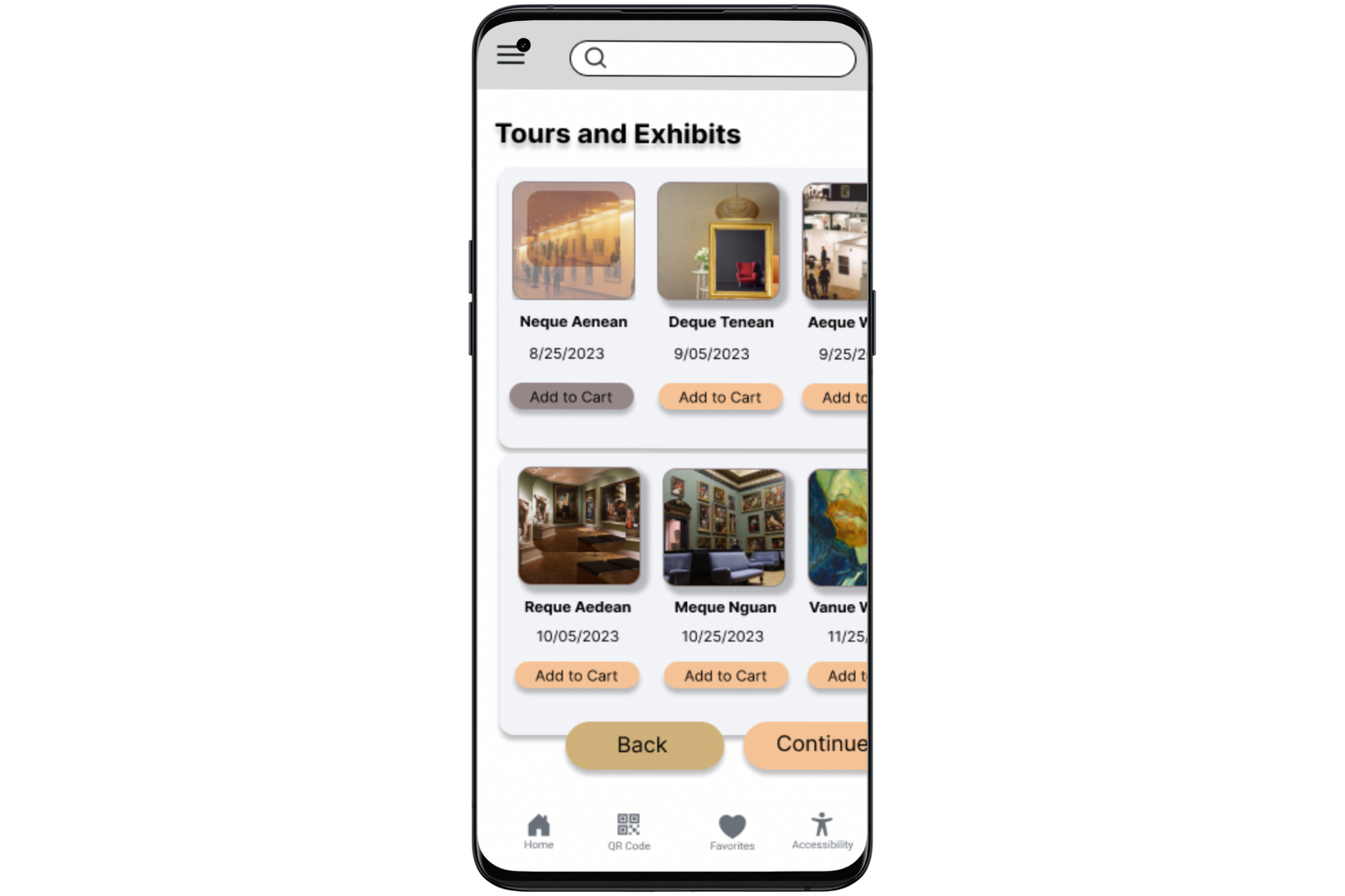
High-Fidelity Prototype
This hi-fidelity prototype defines clearer path for user journey. It demonstrates the connections for each frame.
ConnecTour App
 Accessibility Considerations
Design Principles Utilized
Utilized Gestalt principles for better use of space, proximity, and color contrast.
Accessibility Features
Incorporate accessibility features such as screen readers, adjustable font sizes, and font styles to support users’ needs.
Intuitive Design
Design an intuitive interface to ensure a smooth user flow and facilitate the completion of the end goal for all users.
Final Design Mockup

Next Steps
 Takeaways
Impact:
The app has a clear and convenient solution to user pain points. 100% of participants found this application useful and innovative.
What I learned:
While designing the ConnecTour app, I learned the first ideas for the app are only the beginning of the process. Usability studies opened new ideas and possibilities to create solutions for the everyday art goer and gallery owner.
1. CMS System Development: Focus on developing a CMS (Content Management System) to improve reporting and usage tracking. This will help in managing and analyzing user data efficiently.
2. Enhance User Features: Continue to enhance user features to further improve the overall experience and increase user engagement. Consider adding features such as personalized recommendations, event reminders, and social sharing options.
3. Continuous User Research: Conduct ongoing user research to identify areas of improvement and gather feedback on the app’s usability. This will help in identifying any pain points or opportunities for optimization.
4. Usability Testing: Perform regular usability testing sessions with real users to validate the app’s design and functionality. This will provide valuable insights and help identify any issues that need to be addressed.
5. Iterative Design Process: Embrace an iterative design process to refine and optimize the app based on user feedback and insights. Continuously iterate on the design, making improvements and enhancements to ensure a seamless and user-friendly experience.
6. Accessibility Considerations: Pay attention to accessibility features and ensure the app is accessible to users with disabilities. Implement features such as screen reader compatibility, color contrast adjustments, and alternative text for images to make the app inclusive for all users.
7. Collaboration and Communication: Maintain open communication and collaboration with stakeholders, including the development team, project managers, and other designers. Regularly share updates, gather feedback, and address any concerns or challenges that may arise.