CASE STUDY
Coffee House
Coffee Ordering Application
Product Overview
My Role: UX Designer, Researcher and Developer
UI/UX designer from conception to delivery through agile development and design thinking.
My Responsibilities:
- User Research: Delving into the needs and behaviors of art enthusiasts to inform design decisions.
- Wireframing: Crafting both paper and digital wireframes to lay the foundation for intuitive user flows.
- Prototyping: Developing low and high-fidelity prototypes to visualize the end-to-end user experience.
- Development: Bringing the design to life with functional and responsive code.
- Usability Studies: Conducting thorough testing to refine and enhance the user interface.
- Accessibility: Ensuring the app is accessible to all users, including those with disabilities.
- Design Iteration: Continuously iterating on the design based on user feedback and usability findings.
Purpose
We aim to launch an app that simplifies the coffee ordering process for both individual and group orders. This study will identify user challenges in ordering, pick-up, and dine-in to enhance the user experience
Project Duration:
August 2023-September 2023

The Problem
Frequent Coffee enthusiast are seeking a better way to order and pick up their coffee without having to wait in long lines.
The Goal:
Our Coffee website will let users order their coffee online which will affect frequent coffee patrons by providing a convenient way to order and track their purchase online.

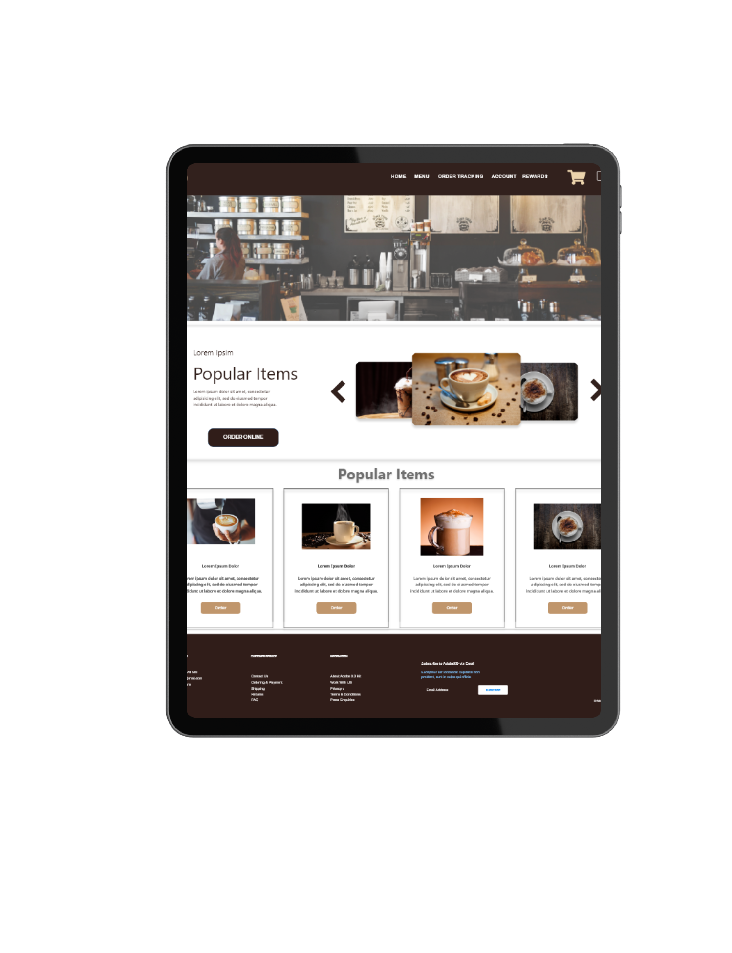
Coffee House Website
Your content goes here. Edit or remove this text inline or in the module Content settings. You can also style every aspect of this content in the module Design settings and even apply custom CSS to this text in the module Advanced settings.


User Research: Summary
Through a series of interviews and the development of empathy maps, I gained a deeper understanding of our target users—locals and habitual coffee drinkers who frequent coffee shops multiple times a month.
Our pre-launch phase was dedicated to evaluating the ease of the ordering process. We sought to uncover the specific obstacles users might encounter, whether ordering for pick-up or dining in, and to explore potential solutions to enhance their experience.
The culmination of this research was to verify whether users could effortlessly complete their intended tasks. The insights gleaned from this process informed the refinement of our user flow and the optimization of the overall user experience.
RESEARCH QUESTIONS
Understanding the User
Competative Audit
Evaluate and analyze competitors in the coffee ordering app market to understand their strengths, weaknesses, and unique features.
Conduct User Study
Conduct research and gather insights from users regarding their preferences, challenges, and expectations when ordering coffee.
Catergorize Feedback
Organize and categorize the feedback received from users during the user study to identify common themes and areas for improvement.
Research Questions
- How long does it take for a user to select and find a coffee item in the app?
- What can we learn from the steps that users take during the ordering process?
- Are there any parts where users are encountering difficulties?
- Can users benefit from QR technology?
Participants
5 participants
- Participants are frequent coffee enthusiasts who order coffee 3-5 times a month.
- Two males, two females, and one individual with a vision impairment, between the ages of 25-75
Methodology
Users were asked to perform tasks in a low-fidelity prototype.
- Unmoderated usability study
- 10 minutes per participant
Geolocation
- United States, Remote Location
Usability Q&A
Interview Questions
Interest
How often do you order coffee?
Participant 1: “About 3-4 times a week.”
Participant 2: “Almost every day.”
Participant 3: “Whenever I need a caffeine boost, so maybe 4-5 times a week.”
Participant 4: “5 times a week, especially during weekdays.”
Participant 5: “Rarely, maybe once every few months due to health reasons.”
Awareness
How do you usually order coffee?
Participant 1: “Through mobile apps.”
Participant 2: “In person at the coffee shop.”
Participant 3: “Online through the coffee shop’s website.”
Participant 4: “Through delivery apps.”
Participant 5: “Through subscription services.”
Challanges
What challenges do you face when ordering coffee?
Participant 1: “Finding all the options and customization choices can be overwhelming.”
Participant 2: “Ensuring the coffee is made to my preferences.”
Participant 3: “Sometimes the wait times are too long.”
Participant 4: “I find it hard to know which coffee options are available.”
Participant 5: “The ordering process is not always clear to me.”
Demand
What features would you like to see in a coffee ordering app?
Participant 1: “Customization options for coffee strength and flavor.”
Participant 2: “Order history and favorites for easy reordering.”
Participant 3: “Rewards and loyalty program integration.”
Participant 4: “Real-time order tracking.”
Participant 5: “High contrast and large fonts for better visibility.”
Expectations
How important is the ease of the ordering process for you?
Participant 1: “Very, I want a quick and seamless experience.”
Participant 2: “Moderately, as long as it’s convenient.”
Participant 3: “It’s crucial; I’ve abandoned orders due to complicated processes.”
Participant 4: “Important, especially if I’m ordering for a group.”
Participant 5: “Very important, and it needs to be accessible.”
Empathize Phase
In the Empathize Phase, the focus is on understanding the users’ needs, experiences, and motivations. This involves engaging with users through interviews, surveys, and observation. The goal is to gather rich, qualitative data that offers deep insights into the users’ world, enabling a human-centered approach to design.
Empathy Map
Participant 1: Sarah, 28, Marketing Professional
Says
- “How do I find coffee flavors that interest me?”
- “Is there a way to customize my coffee order?”
- “The ordering process should be quick; I don’t have time for a lengthy one.”
Does
- Scrolls through coffee options
- Reads coffee descriptions
- Checks prices
- Looks at reviews
Thinks
- “I want to try different coffee flavors but don’t know which ones to choose.”
- “I hope this app makes it easy for me.”
Feels
- Excited but a bit overwhelmed
- Curious about new coffee experiences
- Anxious about making the right choice
Participant 2: Michael, 35, IT Professional
Says
- “I love exploring different coffee brands.”
- “The app should have a favorites section.”
Does
- Tries different coffee brands
- Frequently checks the app for new coffee options
Thinks
- “I wish the app could recommend coffee based on my taste.”
- “How do I know this coffee is worth the price?”
Feels
- Excited about trying new coffee
- Anxious about making the right choice
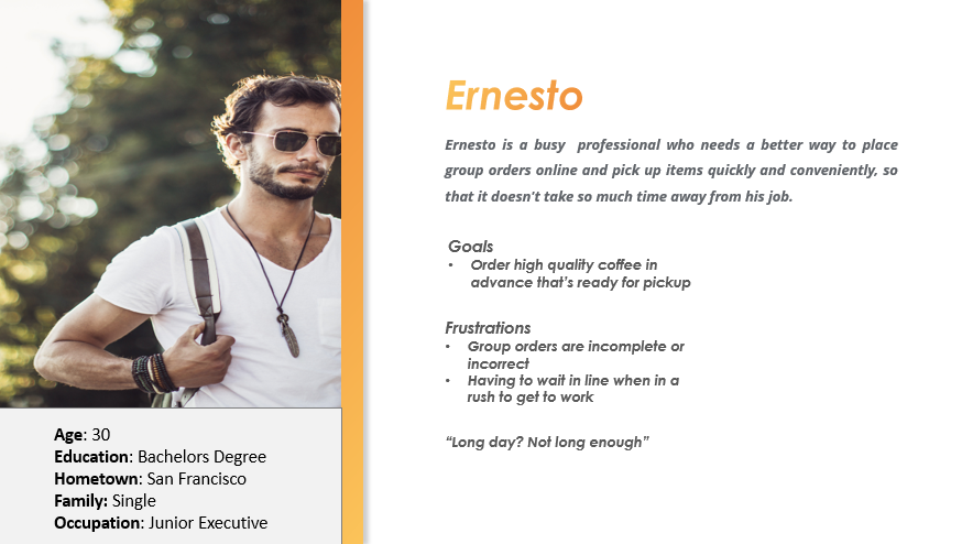
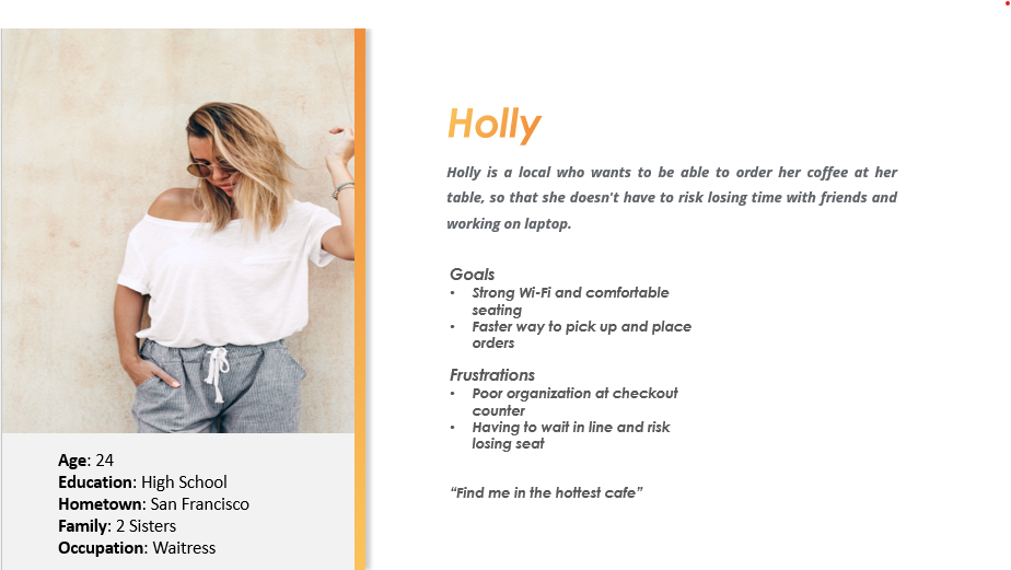
Persona #1
Participant 3: Ryan, 30, Coffee Lover
Says
- “I want to discover unique coffee blends.”
- “Is there a way to filter coffee by roast level?”
Does
- Tries different coffee blends
- Looks for coffee with specific roast levels
Thinks
- “I hope I can find my perfect cup of coffee.”
- “Is the coffee packaging sustainable?”
Feels
- Adventurous in exploring coffee options
- Conscious about environmental impact
Persona #2
Participant 4: Emily, 60, Coffee Enthusiast
Says
- “I enjoy trying different coffee brewing methods.”
- “Is the app accessible for visually impaired users?”
Does
- Explores various coffee brewing techniques
- Uses screen reader to navigate the app
Thinks
- “I wish there were more coffee brewing tutorials.”
- “How can I get assistance if needed?”
Feels
- Excited about experimenting with coffee
- Grateful for inclusive app features
Participant 5: Alex, 25, Coffee Connoisseur
Says
- “I’m interested in specialty coffee from different regions.”
- “Are there any limited edition coffee releases?”
Does
- Explores specialty coffee options
- Keeps an eye out for limited edition releases
Thinks
- “This could be a great addition to my coffee collection.”
- “I hope the taste matches the description.”
Feels
- Enthusiastic about discovering unique coffee
- Cautious about the quality of limited edition releases.
User Reasearch: Pain Points
Group Ordering: Users have reported that large orders are sometimes incomplete or incorrect. This can lead to frustration and inconvenience for users who are placing orders for multiple people or groups.
Convenience: Users have expressed concerns about the inconvenience of getting in line to place an order and potentially losing their place at their table. This can be a source of frustration for users who want to minimize waiting times and maximize their time spent enjoying their coffee.
Unclear Ordering Process: Some users have found the ordering process to be unclear, resulting in confusion and potential frustration. Improving the clarity and intuitiveness of the ordering process can greatly enhance the user experience and make it easier for users to navigate through the app.
Customization Options: Users have mentioned feeling pressured when choosing options at the counter. Providing clear and easy-to-understand customization options can alleviate this pressure and allow users to personalize their coffee orders according to their preferences.
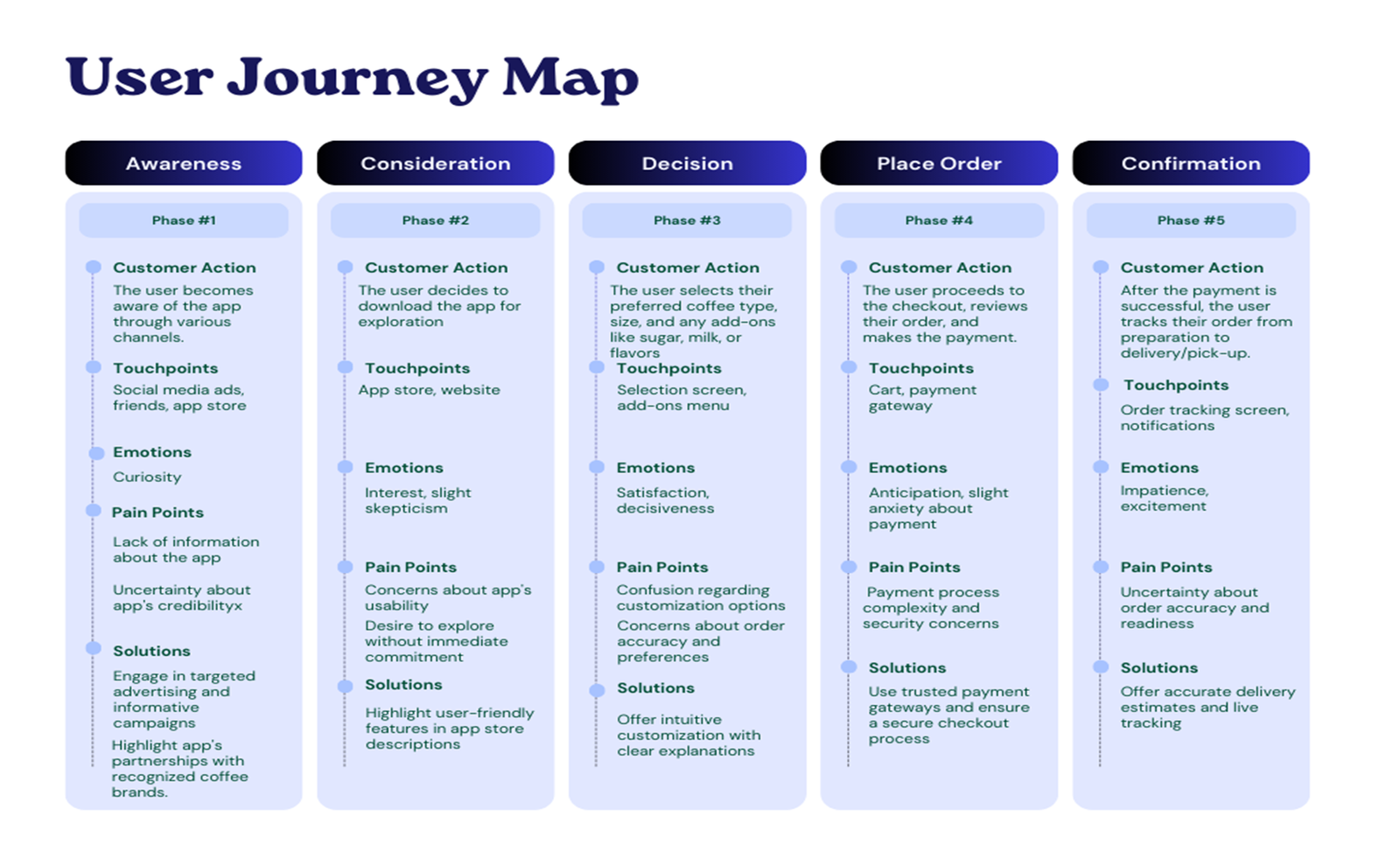
User Story #1
As a coffee shop owner, I want to provide a seamless group ordering experience for my customers, so that they can easily place large orders without any confusion or missing items.
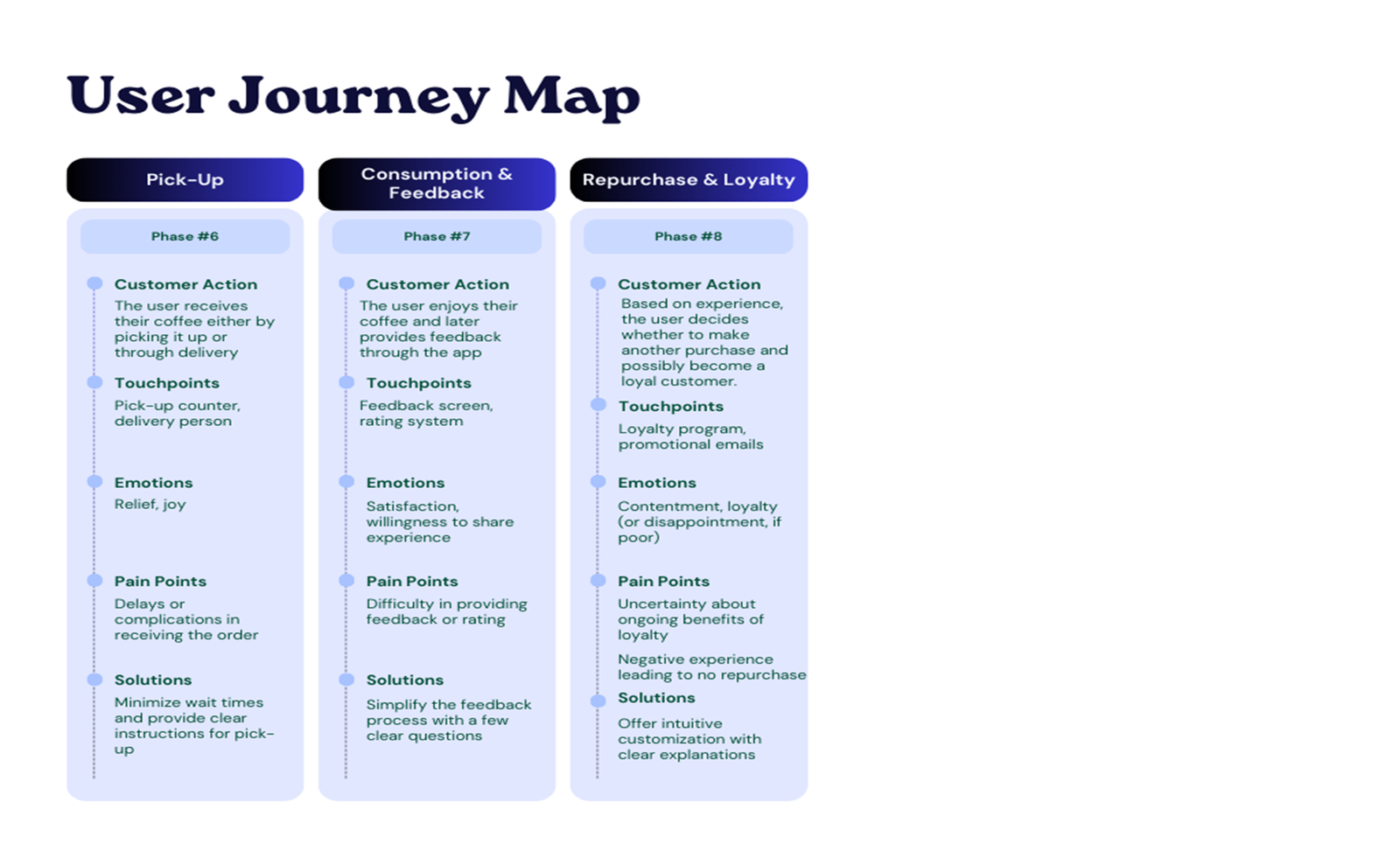
User Story #2
As a frequent coffee drinker, I want to be able to order my coffee online and track my purchase, so that I can save time and have a convenient coffee ordering experience.
Usability Study
Findings and Insights
Multiple usability studies were conducted to gather insights and feedback from users. The findings from these studies provided valuable information for improving the design and usability of the ConnecTour app.
Round 1 Findings:
During the first usability study, several key insights were gathered:
- Users need to be able to order items with simple navigation ques.
- Users want to feel secure when paying online.
- Users want to be able to track their order in real time
Round 2 Findings:
In the second round of usability testing, additional insights were obtained:
- Users found order tracking to be a helpful feature.
- Users want to be able to save their favorites
Recommendations
Based on Usability Study Findings
By implementing these recommendations, the ConnecTour app will be designed to address the pain points identified in the usability study and provide a more user-friendly and streamlined experience for booking art tours.
Streamline the Adding to Cart Process:
Users need to be able to order items with simple navigation cues. Ensure that the app’s interface is intuitive and easy to understand, allowing users to quickly find and select their desired coffee options.
Enhance the Ordering Process:
Enable order customization and favorites: Users want the ability to customize their coffee orders and save their favorites for easy reordering. Implement customization options for coffee strength, flavor, and add-ons. Additionally, allow users to save their favorite orders for quick and convenient reordering.
Optimize checkout process:
Users should be able to complete the checkout process smoothly and without confusion. Streamline the payment options, provide clear instructions, and minimize any potential friction points to ensure a seamless and hassle-free checkout experience.
Enhance payment security:
Users want to feel secure when paying online. Implement robust security measures, such as encryption and secure payment gateways, to protect user payment information and build trust with users.
Ideate
During the Ideate Phase, the goal is to generate a wide range of creative solutions to the defined problem. This phase involves brainstorming sessions, sketching, and exploring different perspectives. It’s a divergent phase where quantity is encouraged to open up the possibility of innovative solutions.
Theme #1 Simplifying the Coffee Ordering Process:
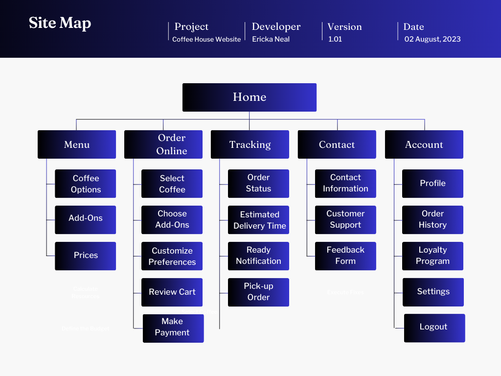
The main theme of the coffee house case study is to create an app that simplifies the coffee ordering process for both individual and group orders. The goal is to enhance the user experience by addressing user challenges in ordering, pick-up, and dine-in.
Theme #2 User-Centric Design and Personalization:
Another important theme is the focus on user-centric design and personalization. The app aims to provide customization options for coffee strength and flavor, order history and favorites for easy reordering, rewards and loyalty program integration, and real-time order tracking. These features cater to the preferences and needs of the users, allowing them to personalize their coffee experience.
Theme #3 Efficiency and Convenience:
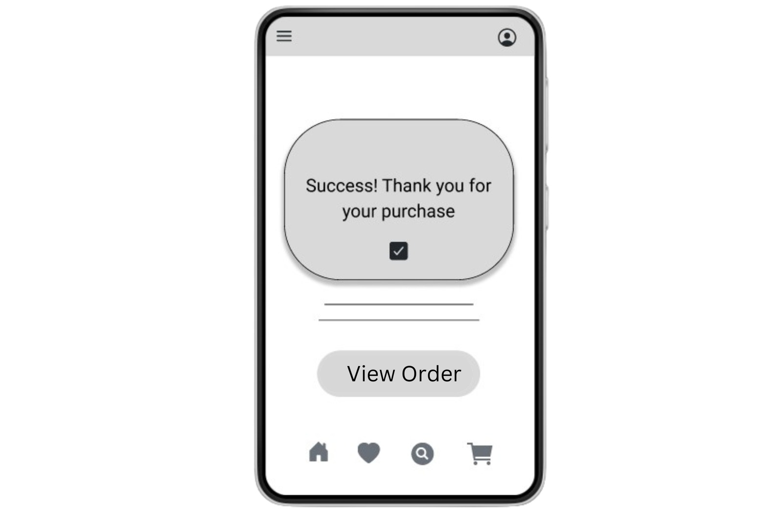
The theme of efficiency and convenience is highlighted throughout the case study. Users expressed the importance of a quick and seamless ordering process, especially for busy professionals. The app aims to minimize wait times, provide easy access to coffee options, and offer features like pre-ordering and pickup to enhance convenience.
Theme #4 Accessibility and Inclusivity:
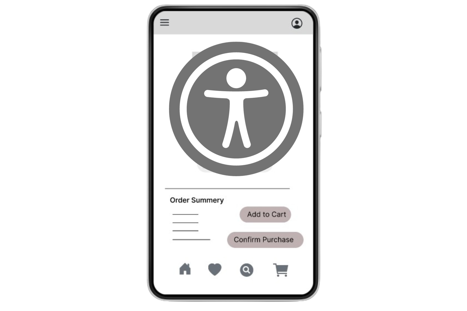
The case study also emphasizes the importance of accessibility and inclusivity. Participants with visual impairments highlighted the need for high contrast and large fonts for better visibility. The app aims to ensure accessibility for all users, regardless of their abilities.
Define Phase
The Define Phase is where insights from the empathize phase are synthesized into a clear problem statement. This phase involves identifying core user needs and defining the scope of the challenge. It’s about distilling the information gathered into a focused direction for the design, ensuring that the project stays user-centered.
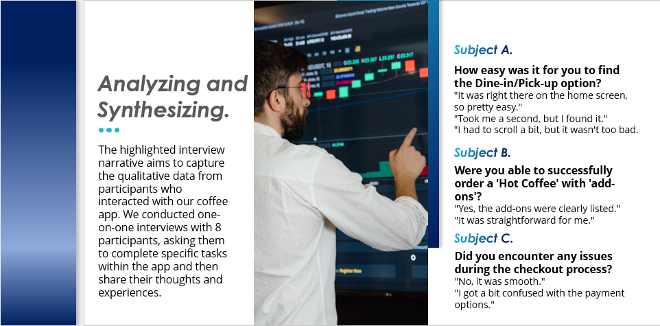
Qualitative Insights:
Ease of Use: Most users found the app easy to navigate.
QR Tech: High engagement and positive feedback.
Pain Points: Add-ons were a bit hidden; needs better UI.
AI Potential: Users are excited about personalized recommendations.
Quantitative Insights:
Time on Task: 90% of participants completed tasks within 5 minutes
Conversion rates: 100% from selection to checkout
System Usability Scale (SUS Score): 80% out of 100%
Synthesized Recommendations
- Welcome Screen: Provide clear and straightforward options on the welcome screen to help users easily navigate to their desired actions. This will ensure a seamless onboarding experience and reduce any confusion or friction.
- Adding Items to Cart: Simplify and make the process of adding items to the cart more intuitive for users. Reduce the number of steps involved and provide clear instructions or cues to guide users in selecting and adding items to their cart.
By implementing these recommendations, the Coffee House Site can enhance its usability and provide a more user-friendly experience for booking art tours.
Design Phase
The Design Phase is where concepts start taking shape. This involves creating wireframes, prototypes, and high-fidelity designs. It’s a phase of iterative design, where feedback is continually sought from users and stakeholders to refine and improve the design. This phase ensures that the solution is both aesthetically pleasing and functionally effective.
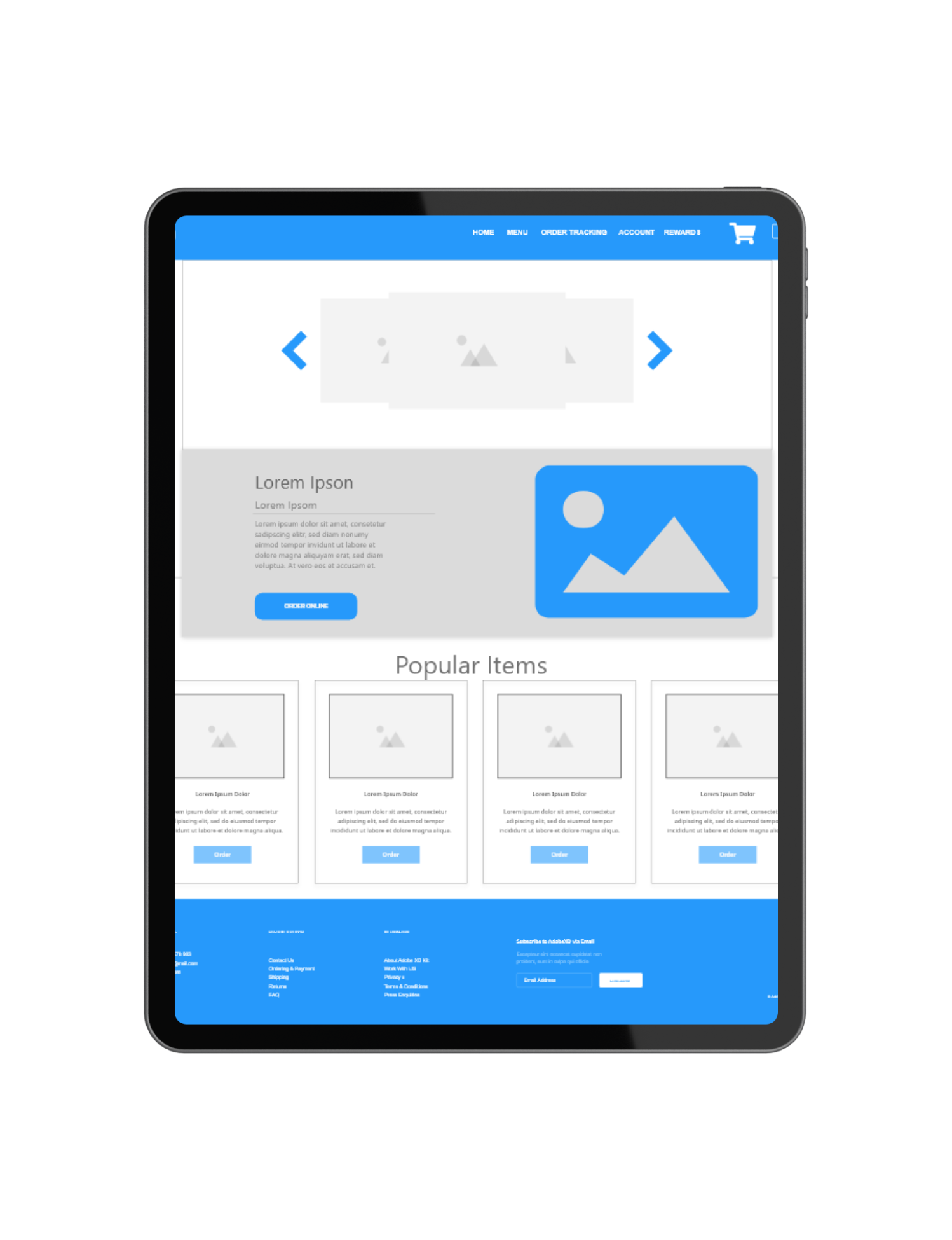
Paper wireframes
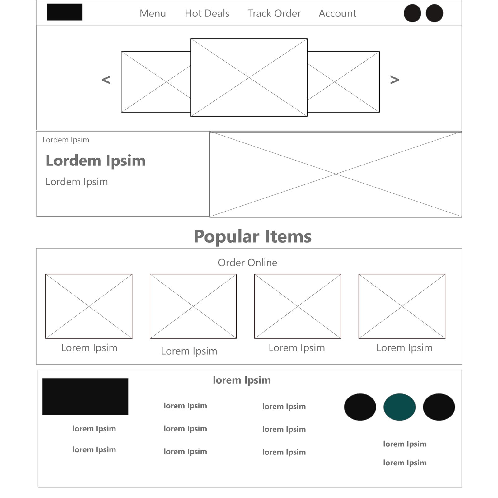
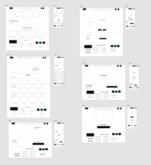
Drafting interactions of each screen helped to design a well-suited path to address users pain points. Each element of the app prioritizes a quick and easy selection process to guide the user through a seamless path.
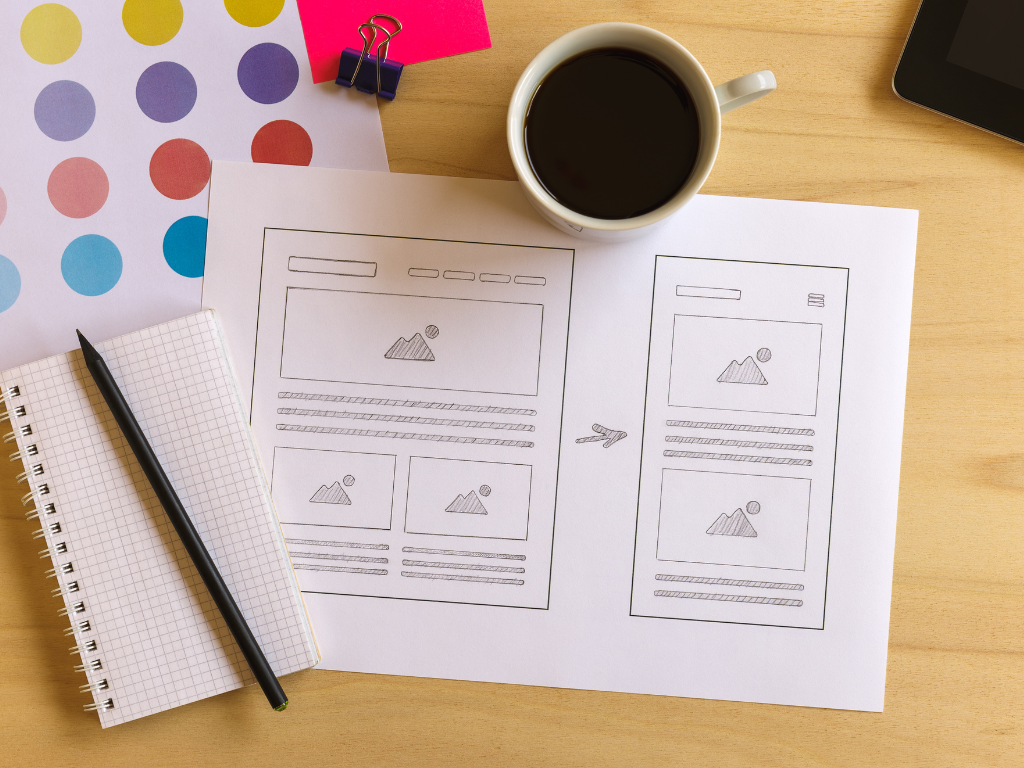
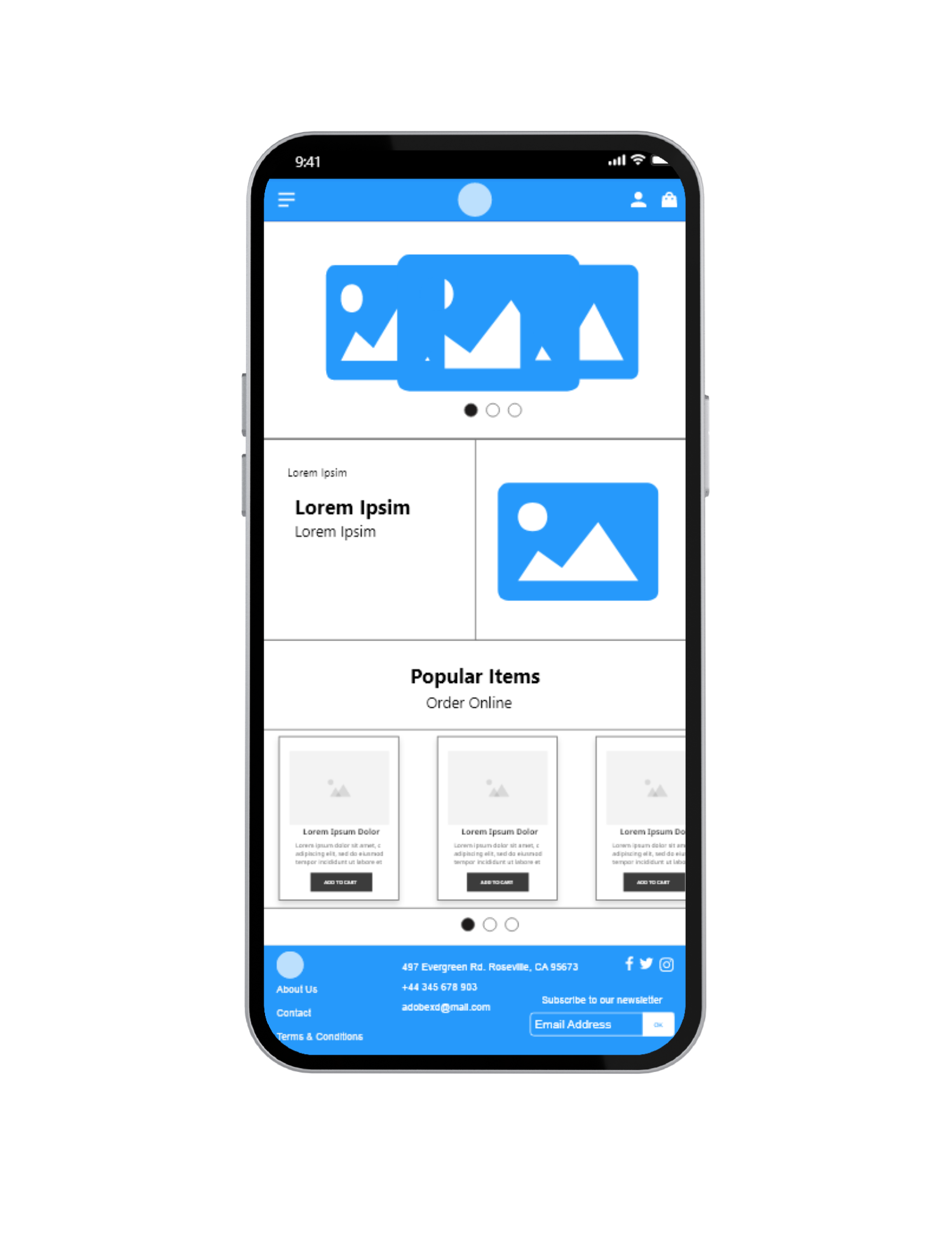
Digital wireframes
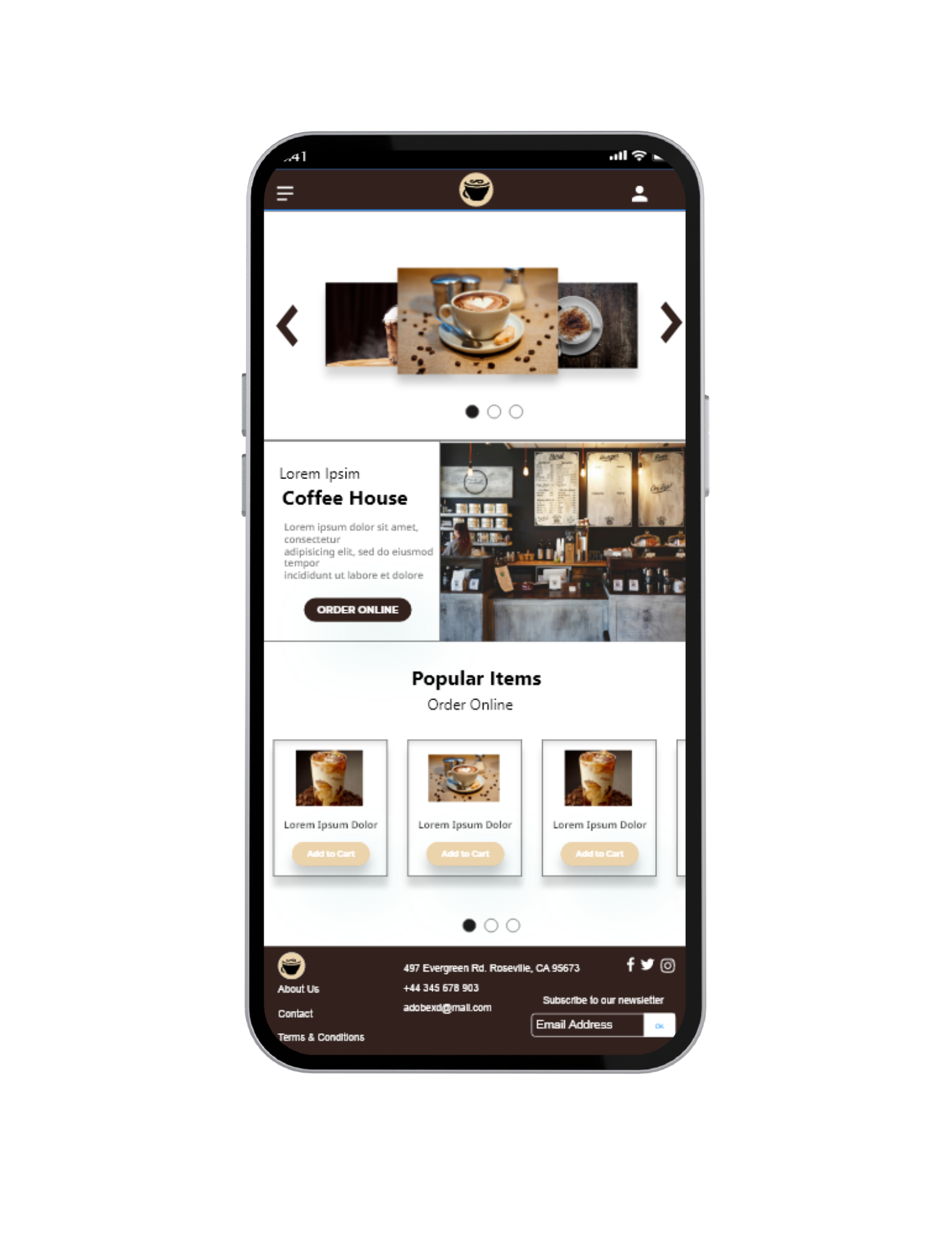
For the initial design I was going for simple, modern and contained for easy access to address users pain points. This design is to demonstrate a responsive design for mobile users.
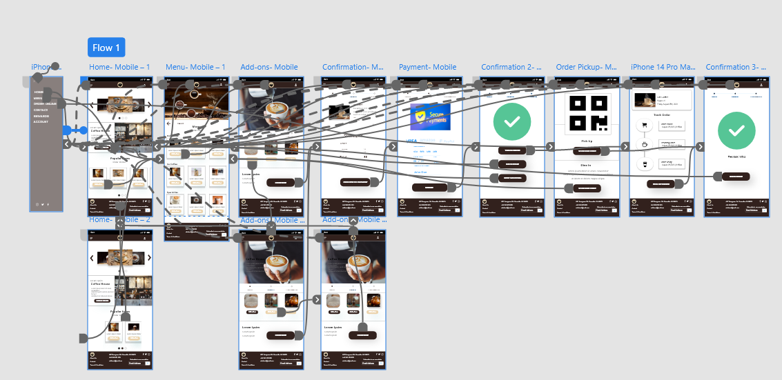
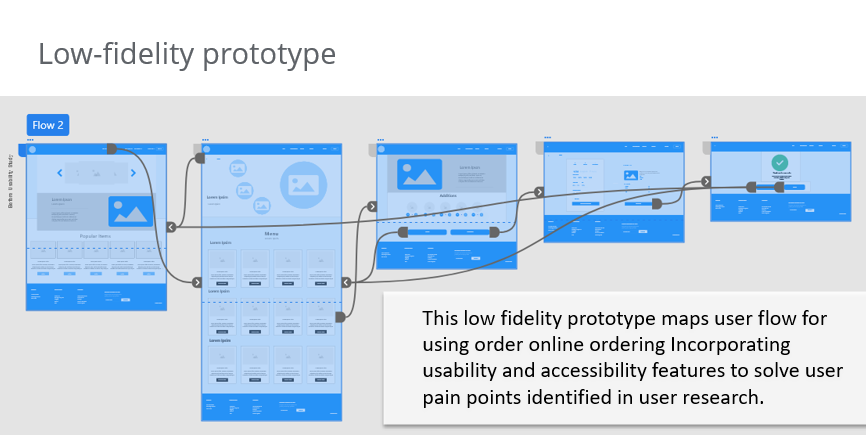
Low-fidelity prototype
This low fidelity prototype maps user flow for using order online ordering Incorporating usability and accessibility features to solve user pain points identified in user research.
The final frame demonstrates an easy process to improve user experience based on user research and feedback.
Coffee House Site
Development Phase
In the Development Phase, the design is transformed into a working product. This involves coding, testing, and debugging. It’s a collaborative effort between designers and developers to ensure that the final product aligns with the design vision and meets the users’ needs. This phase also includes user testing to iron out any issues before the final launch.
Style & Imagery

#56C596

#C0966C

#EBD3AC

#32211D

#2699FB
Aa
Segoe UI 70pt
Segoe UI BOLD 50pt
Noto Sans Regular 30pt
Noto San SEmiBold 16pt
Noto Sans Mediun 16pt
Vestibulum ante ipsum primis in faucibus orci luctus et ultrices posuere cubilia Curae; Donec velit neque, auctor sit amet aliquam vel, ullamcorper sit amet ligula. Cras ultricies ligula sed magna dictum porta. Mauris blandit aliquet elit, eget tincidunt nibh pulvinar a. Sed lectus nibh.
Mockups
Considering users frustrations during study, call of action was added to improve usability. Font size was also increased to improve visibility for customizations.
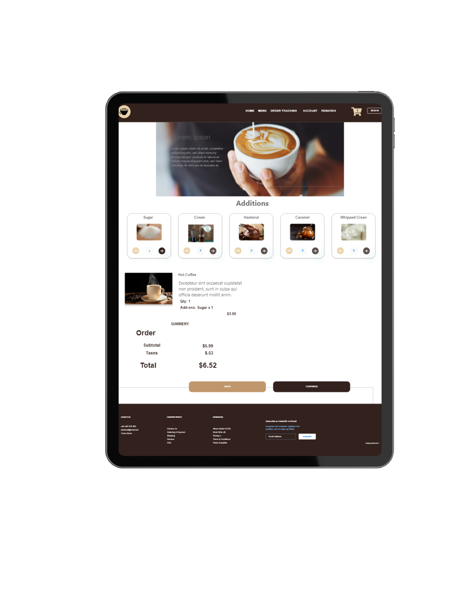
High-Fidelity Mockup
Based on user research, orientation and design was slightly adjusted to provide a welcoming experience.
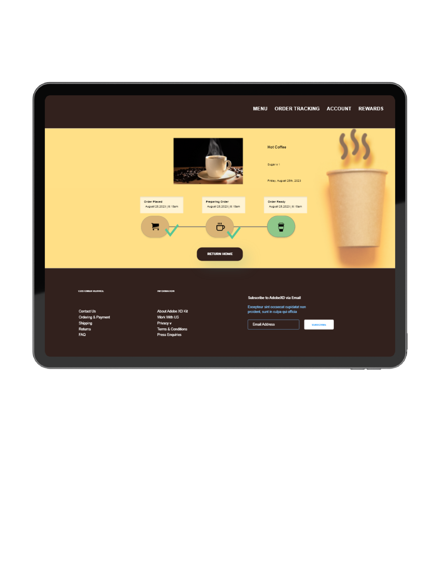
This design addresses pain points identified in user research to provide a secure payment method and real time order tracking.
High-Fidelity Prototype
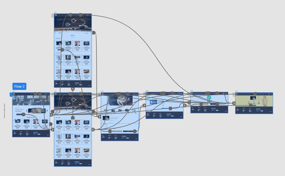
This hi-fidelity prototype defines clearer path for user journey. It demonstrates the connections for each frame.
Coffee House Responsive Website
Accessibility Considerations
Voiceover and Screen Reader Compatibility
Ensure that all elements on the app are labeled properly so that screen readers can accurately describe them to users with visual impairments. This includes buttons, images (via alt text), and form fields. Make sure to test the app with Voiceover (iOS) or Talkback (Android) to ensure a smooth user experience.
Color Contrast and Font Size
High contrast between text and background colors is essential for users with vision issues, including color blindness. Also, offer an option to adjust the font size for better readability. Tools like Web Aim’s Color Contrast Checker can help you determine if your color choices meet accessibility standards.
Keyboard Navigation and Focus Indicators
For users who rely on keyboards or other assistive devices for navigation, it’s crucial to ensure that all interactive elements are navigable via keyboard commands. Additionally, visible focus indicators should be present to guide users through the navigation.
Based on the case study, here are some suggested next steps:
- CMS System Development: Focus on developing a CMS (Content Management System) to improve reporting and usage tracking. This will help in managing and analyzing user data efficiently.
- Enhance User Features: Continue to enhance user features to further improve the overall experience and increase user engagement. Consider adding features such as personalized recommendations, event reminders, and social sharing options.
- Continuous User Research: Conduct ongoing user research to identify areas of improvement and gather feedback on the app’s usability. This will help in identifying any pain points or opportunities for optimization.
- Usability Testing: Perform regular usability testing sessions with real users to validate the app’s design and functionality. This will provide valuable insights and help identify any issues that need to be addressed.
- Iterative Design Process: Embrace an iterative design process to refine and optimize the app based on user feedback and insights. Continuously iterate on the design, making improvements and enhancements to ensure a seamless and user-friendly experience.
- Accessibility Considerations: Pay attention to accessibility features and ensure the app is accessible to users with disabilities. Implement features such as screen reader compatibility, color contrast adjustments, and alternative text for images to make the app inclusive for all users.
- Collaboration and Communication: Maintain open communication and collaboration with stakeholders, including the development team, project managers, and other designers. Regularly share updates, gather feedback, and address any concerns or challenges that may arise.
Takeaways
Impact:
Our target users shared that the design was a clear and convenient solution to user pain points. 100% of participants found this application useful and innovative.
What I learned:
User engagement peaks in the morning, indicating the app’s role in users’ morning routines. Slow load times and a lack of customization options are significant barriers to a seamless user experience. There’s a strong desire for personalized experiences, which could be fulfilled through AI integration.

